雲極接待中心
台北辦公室設計|新古典與現代風格的完美融合|翰昌地產 雲極接待中心案例
榮獲 義大利 A’Design Award 銅獎
榮獲 Idea-Tops 艾特獎 會所設計優秀獎
【新古典融合現代風格】俐落而現代的語彙.搭配豐富的材質肌理.呈成出品味與質感
【翰昌地產 雲極接待中心】
此案為台北地區建商銷售接待中心,為商業空間規劃案。
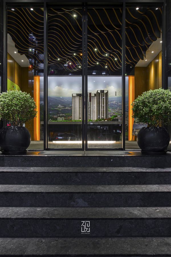
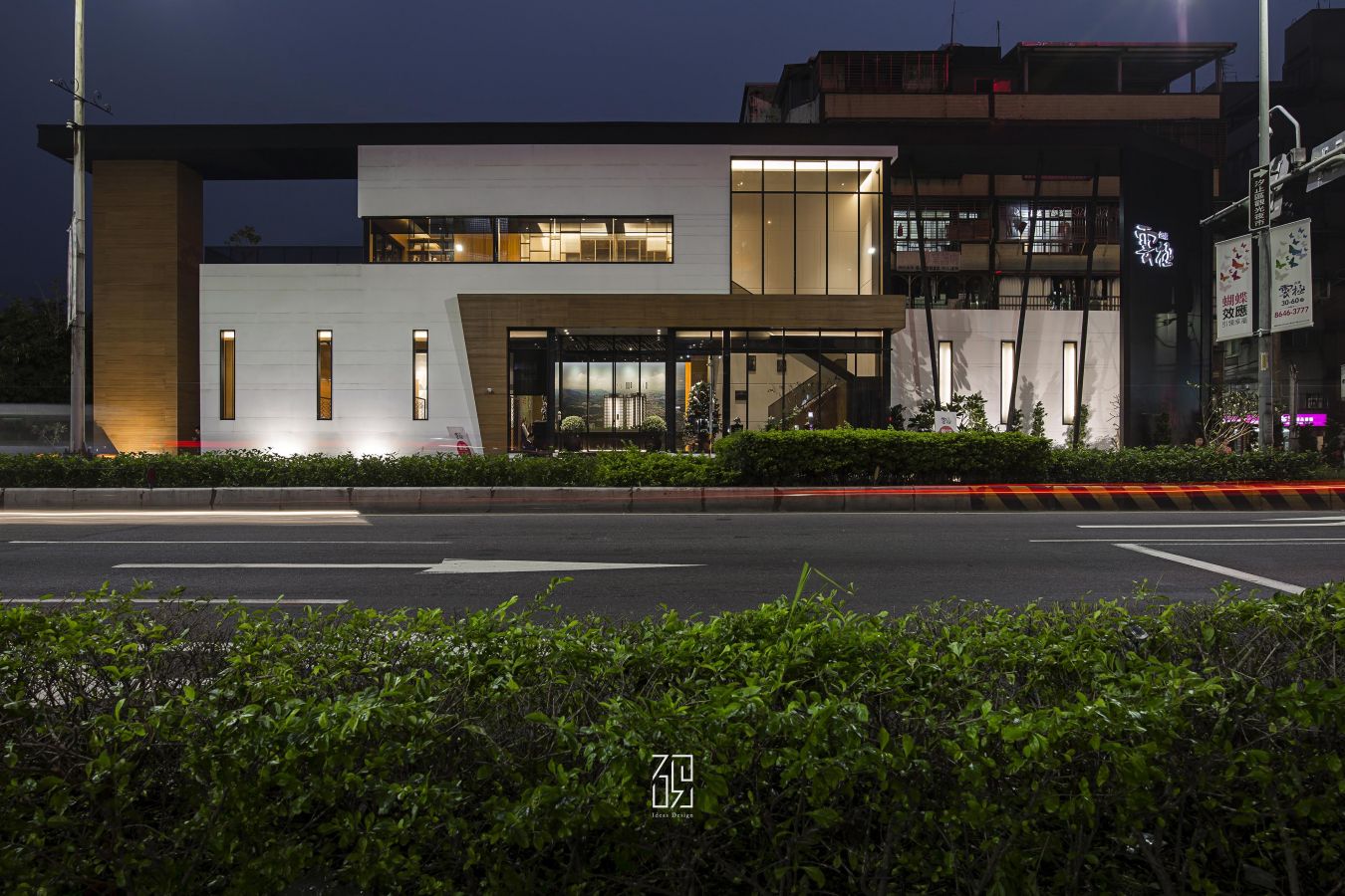
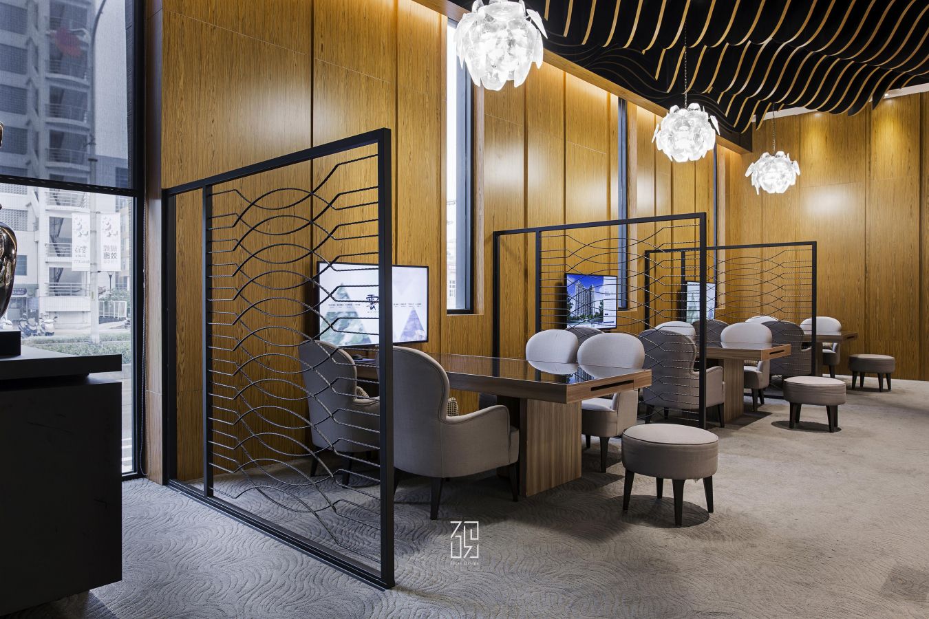
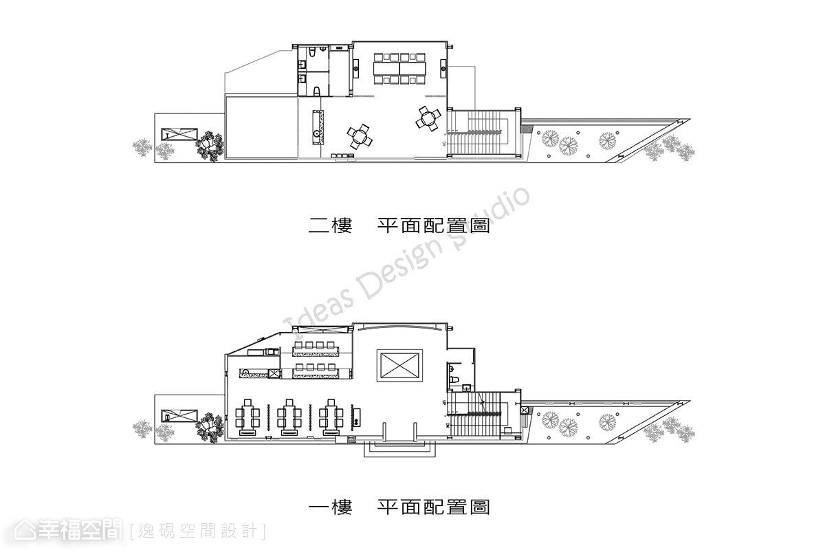
一樓規劃有大廳櫃台、模型展示區、客戶洽談區,二樓則規劃更具隱私的接待空間。此基地形狀原為三角形,在外觀的設計上拉寬了整體比例,在建築量體上以對稱中的不對稱形式展現創造性,大片落地開窗亦成為最好的展示櫥窗,吸引來往人潮駐足,在構思空間性質與使用性上表現出空間規畫的見解,並讓畸零地能有空間放大的錯覺。
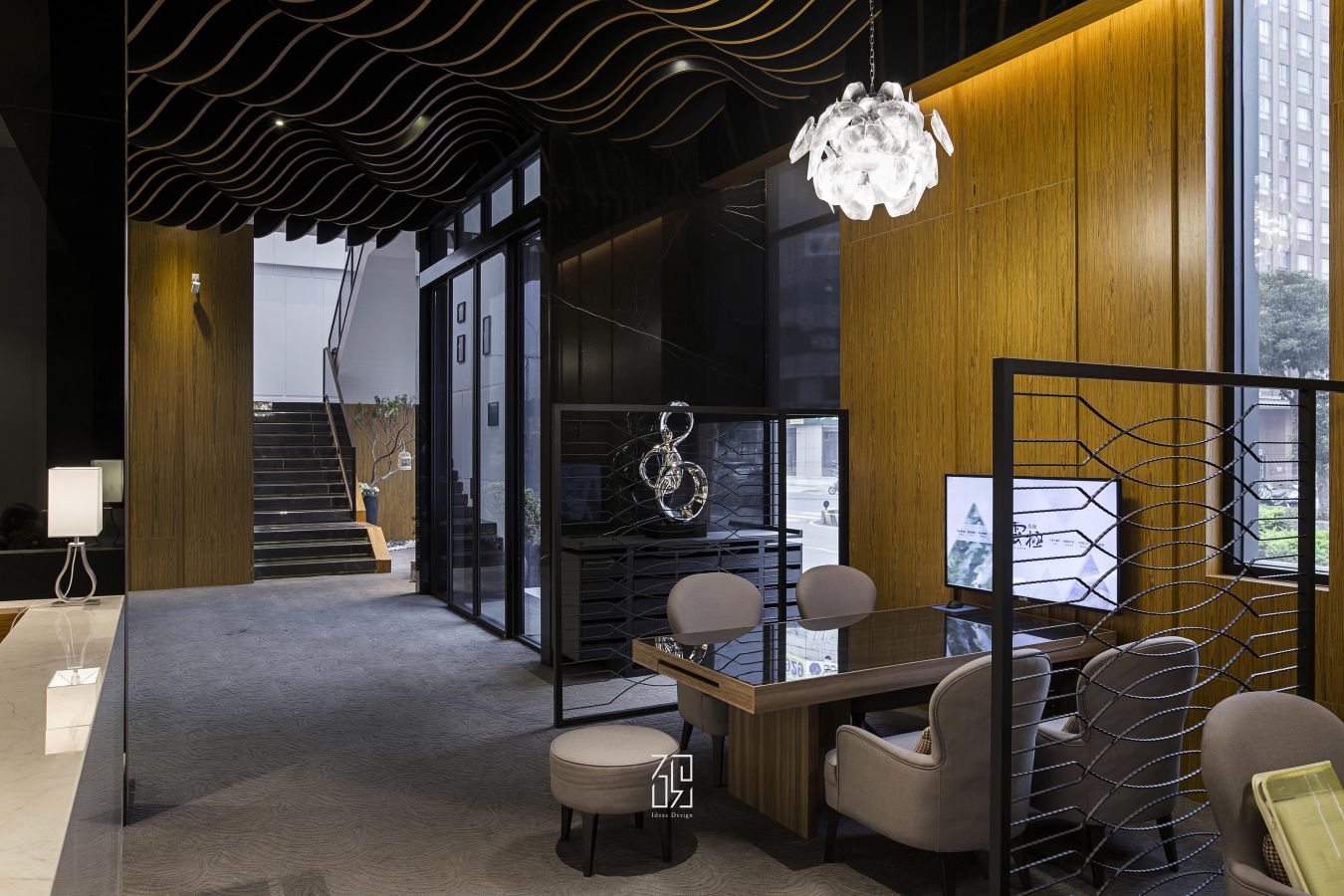
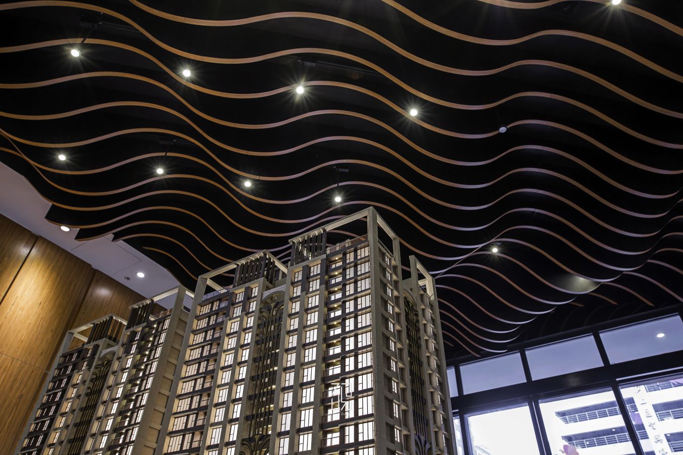
一樓空間大量樓的木作波浪天花板代表浩瀚雲海,躍動的姿態呈現出空間中的韻律,而外觀的木紋運用矽酸鈣板染色非木皮。卻能與四周的淺色木皮融為一體。
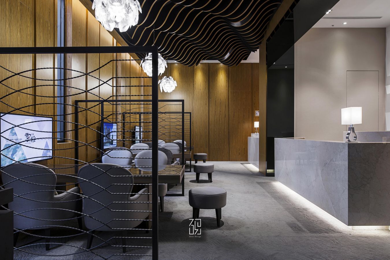
將木紋質感呈現在三維空間中的二維。整體納入無色度的灰階與淺木色相襯,營造寧靜的場域氛圍。入門前方為樣品展示區,接待櫃台與右側洽談區,利用材質暗示空間的分區。
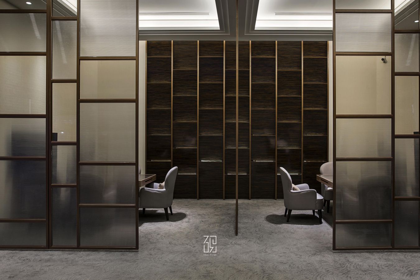
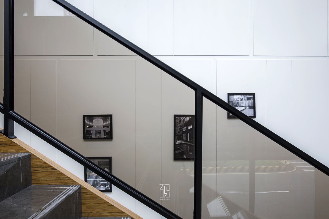
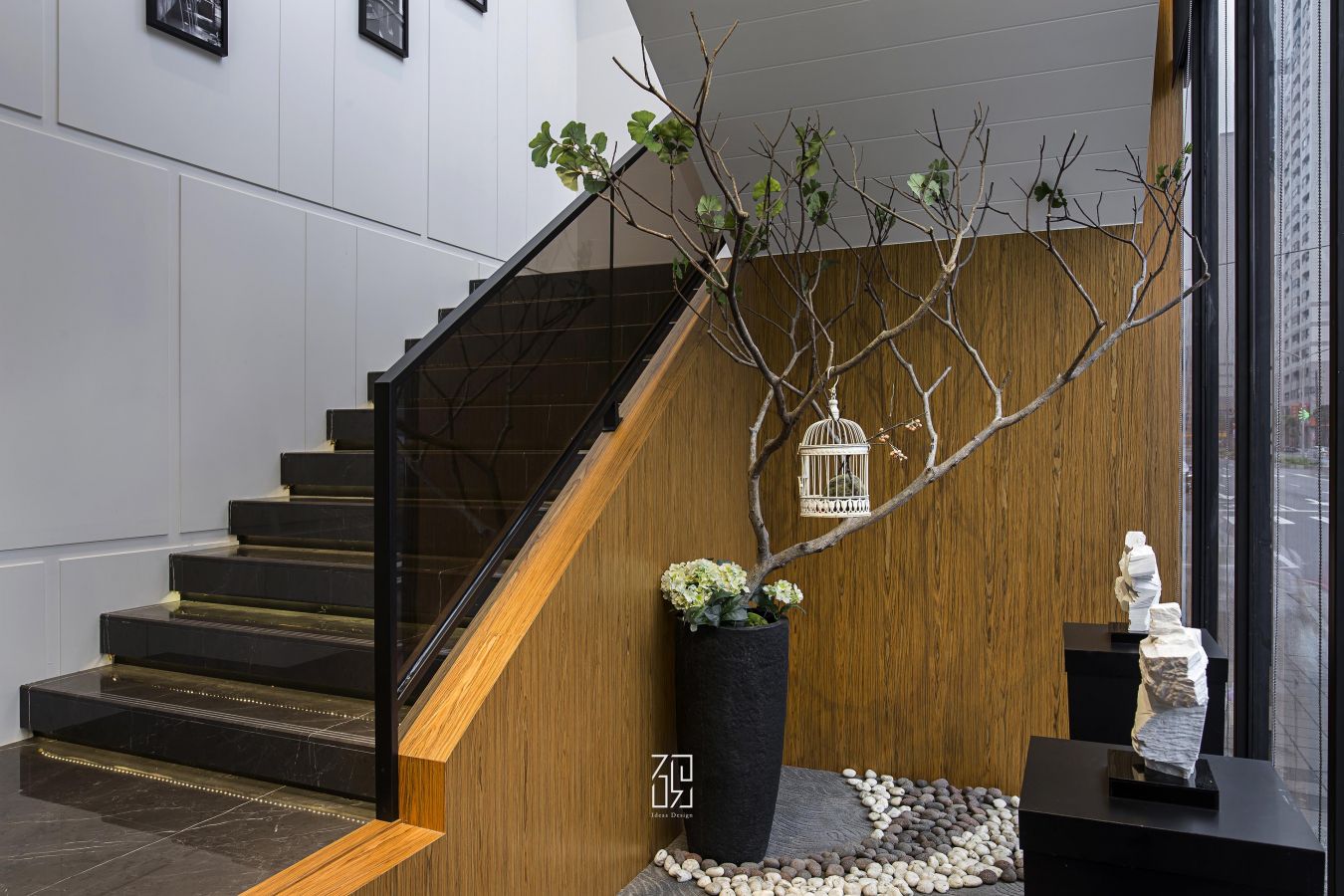
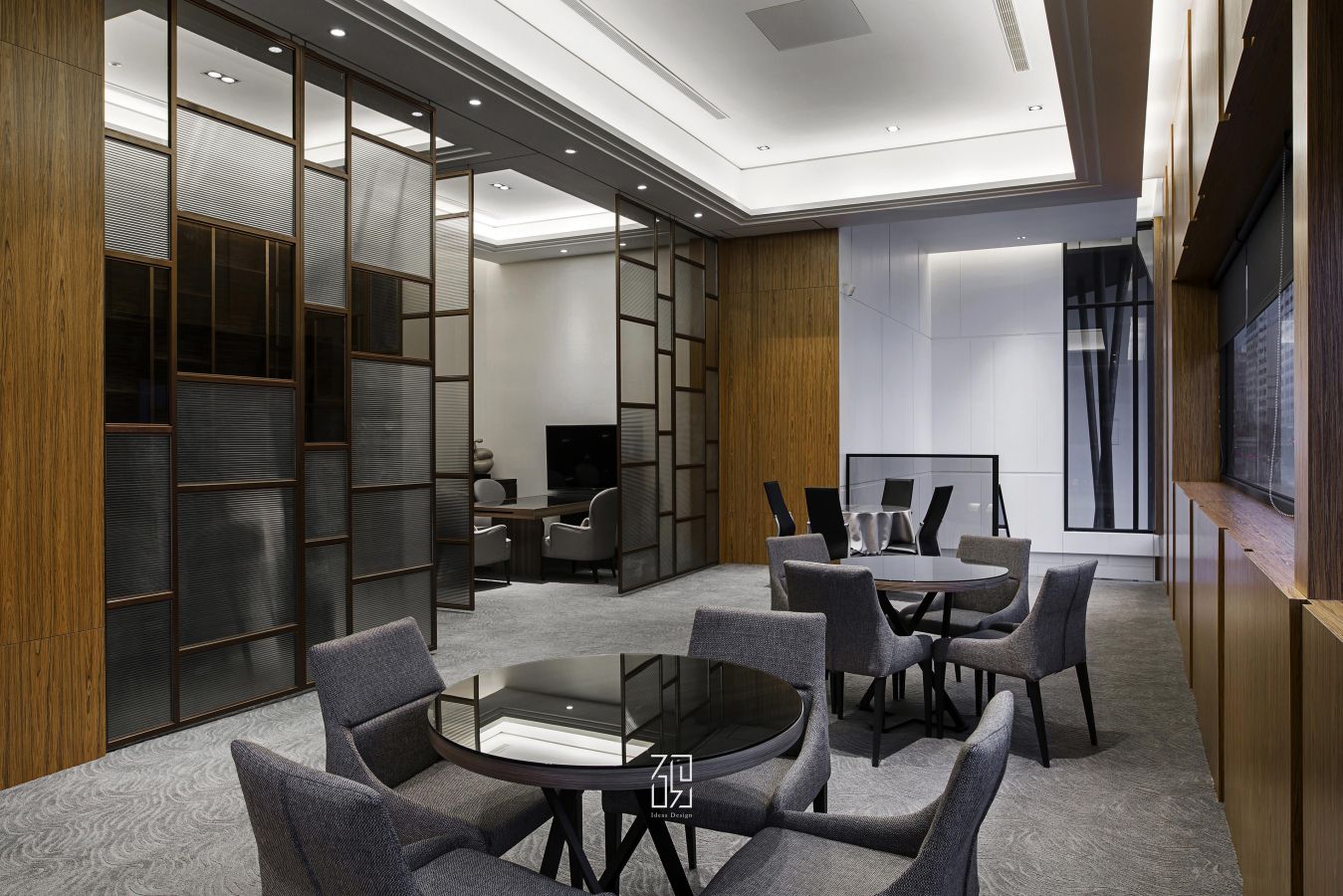
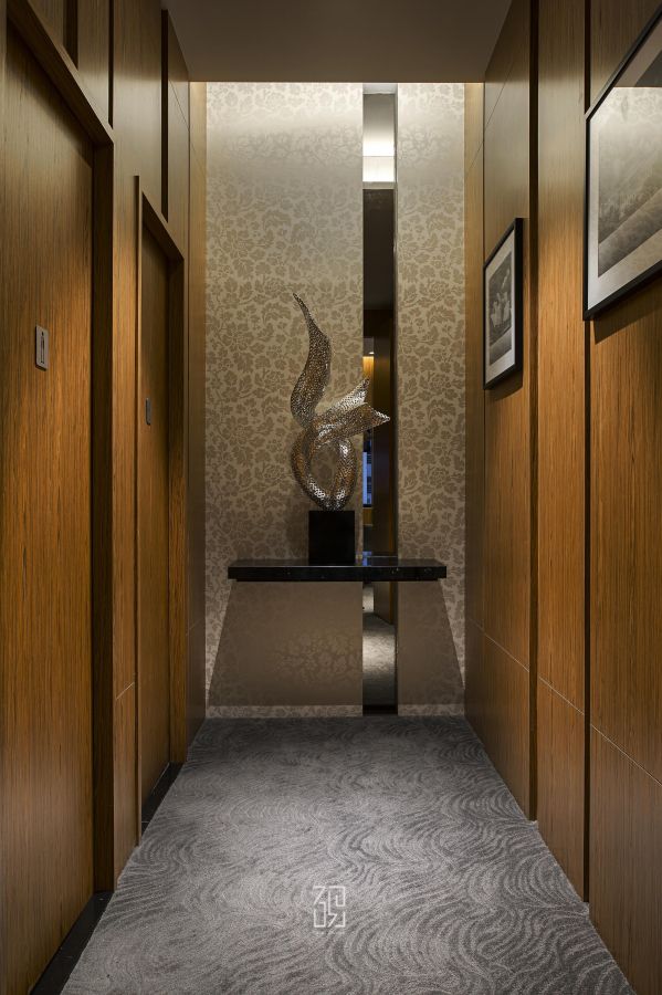
空間右側規畫梯間,藉由牆面設計和樓梯形成落地窗內視的特殊造型。沿動線上二樓洽談區,則採取空間切分,運用霧面拉門使洽談不受干擾,整體氣氛的掌握是促成銷售業務的一大重點。業主亦希望顧客進入此空間時,可以發現建商對空間掌握的細節、工法的用心同時增進顧客對產品的了解。空間內部使用木質面與展示櫃體呈現不同於一樓的日式風格,搭配柔和的間接光源,一反暫時性使用空間的粗糙質地、呈現細膩質感。
【Cloud End】
This is a commercial space project for a constructor’s sales reception center, with the lobby reception counter, the prototype display area and the client discussion area planned for the ground floor, while the reception space with more privacy is planned for the second floor. The original shape of this base was triangular, and the overall proportion is widened for the aesthetical design, while creativity is demonstrated through the asymmetrical forms within the symmetry of the building volume, the large French window also becomes the ideal display window, attracting the passing by crowd to take a break here, demonstrating perspective towards spatial planning when thinking about the nature of the space as well as the usage functions, further allowing the odd shaped land with the illusion of enlarged space.
The massive amount of wooden wavy ceiling in the ground floor space represents the vast sea of clouds, where the dynamic posture demonstrates the rhythm within the space, while the aesthetical wood patterns applied calcium silicate dye instead of veneer, yet it is capable of becoming one with the surrounding pale colored veneer, thereby demonstrating the wood pattern texture in the second dimension within the third dimension. The overall area included non-chromatic grey tone complemented by pale wooden color to create the tranquil atmosphere in the venue. The front part at the entrance is the prototype display area, the reception counter with the discussion area on the right, where the space is separated by the use of material implications.
Planned on the right side of the space is the staircase, forming the unique shape of the French window internal view via the wall design and the staircase. Follow the circulation to go up towards the discussion area on the second floor, which adopted spatial partitioning, using matt sliding doors to accomplish uninterrupted discussions, as taking control over the entire atmosphere is one main key point to successful sales business. The proprietor also hopes that the clients may discover the constructor’s control over the space, as well as the effort put into the details and techniques upon entering this space, thereby enhancing the clients’ knowledge towards the product. The internal space used wooden surfaces and display cabinets to demonstrate the Japanese style differing to the ground floor, subverting the rugged texture of spaces with temporary usage to demonstrate the elegant and exquisite quality with the use of soft and indirect light source.
